
In true capital city form, the Wizards took the safe route, transitioning to the patriotic red-white-blue color scheme and incorporating the Washington Monument wherever possible. It could be worse - the team could've given into fans' calls to revive the famed Washington Bullets brand, but that would've made the Wizards a punchline yet again in the running joke that is Washington sports.
The Wizards have quite a history: they began as the Chicago Packers in 1961 and later changed their name to the Zephyrs. In 1963, the franchise moved to Baltimore, Maryland and became the Baltimore Bullets. Let's take a look at how it all began:
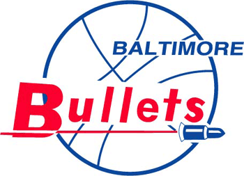 |
The original Bullets logo from 1963/64 - 1968/69: It's hard not to *wince* |
 |
The team logo from 1974/75 - 1986/87: Thankfully, the flying bullet is gone and we're playing with two hands |
 |
Official team logo from 1987/88 - 1996/97 |
 |
The original Washington Bullets uniform |
 |
Major brand overhaul from 1997/98 - 2006/07: We meet the wizard |
 |
Alternate logo from 1997/98 - 2006/07 |
 |
The old school Washington Wizards uniform |
| The 2011 Transition: Quite a dramatic shift, no? {read: sarcasm} |
Alternate logo #1: In tribute to the team's history, this graphic mimics the “i’s” in the former all lowercase Washington Bullets logo, as well as the hand reaching for a ball |
 |
Alternate logo #2: A nice graphic incorporating the Washington Monument, but it doesn't seem to fit with the overall brand package |


 |
Alternate word marks: Can you spot the Washington Monument? Enough already! There's also a lack of consistency with the use of uppercase and lowercase. |
 |
| The new school Washington Wizards uniform: It all comes together pretty nicely here, but that's mostly due to the use of color-blocking and the arrangement of elements than the brand marks |
So the "monumental" question is: Did the Wizards get it right? Does their attempt to blend old school and new school qualify as an improvement, a major disappointment or is it simply "meh"-worthy?
TSR's Call: As they so often do on the court, the Washington Wizards missed a golden opportunity. There is no winner here.
This was their chance to make a statement. With Ted Leonsis' leadership, the Wizards could've made a major change to excite fans and the basketball world by doing the unthinkable: getting rid of that stupid wizard. As one of the lamest mascots ever, there's just no way to make this team's identity cool with a wizard attached to it. So please, give it up!
Washington could've polled fans to pick a new franchise name (a la the Oklahoma City Thunder) and reinvigorated the city's sports scene with a completely new look. They could've gotten really crazy and even considered NOT using red-white-blue to distinguish themselves from DC's other teams. In theory, it's nice to unify the city's sports teams, but when you can't tell the difference between a Capitals, Nationals and Wizards shirt from the back, everything just seems too similar. Teams thrive on their unique identities and fans want to be part of that.
In predictable fashion, the Wizards had their shot and missed. There could be a comeback in their future, but they have to be willing to take the risk and finally make that creepy wizard magically disappear.
Do you agree with TSR's call? Sound off in the comments!
XO,
The Style Ref