
Here are a few of the usual suspects:
 |
| Clemson Orange & Purple |
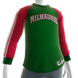 |
| Milwaukee Bucks Red & Green |
 |
| Miami Dolphins Orange & Green |
 |
| Pittsburgh Penguins Black & Yellow |
 |
| New York Mets Blue & Orange |
While they may be difficult to look at, it's easy to see that these color combinations don't work well and therefore, wouldn't look good on most people. They're either too bold, blindingly vibrant or hopelessly clashing.
If your team is guilty of a poor color combo, it doesn't mean you have to sacrifice your style to represent. Choose black or white options (which look great on everyone) and even consider non-traditional colors depending on what suits you best. You can get apparel for most teams in every color of the rainbow, so the choices are endless. No matter what hue you wear to support your team, your true colors will always shine through.
Which team do you think has the worst colors?
XO,
The Style Ref